My360 Optimization, Standard Bank
The problem
Standard bank has challenged us to help them understand how to evolve My360 into a future-ready and client oriented state. Our main purpose is to answer these two questions:
1. Why are people not using the app?
2. Why are clients not linking their accounts?
To identify the best routes for standard bank to optimise and leverage the power of My360 to deliver new differential customer-centric experiences and to demonstrate a new relationship with customers.
The metodology
In order to respond to these 2 questions, we have followed a methodology that allowed us to analyse the My360 reality through internal, external and client lenses:
1. Internal perspective insights
Through a heuristic and functionality analysis, gain insight into what the app is able to do and how it is performing in terms of customer experience.
2. User perspective insights
Through interviews with financial advisors and app users, collect information about how customers feel about My360 and how they behave with the app.
3. Key takeaways and conclusions
Through the consolidation of all gathered insights, development of main conclusions about the app current state and user propensity of usage
4. Roadmap and recommendation
Through the gathered insights, identify the possible routes for the future of My360 and provide a recommendation and a coherent roadmap of initiatives.
Heuristic Analysis: User interface and experience frictions
A) The number of clicks that the user has to do and the time spent on some tasks are high. Some of the tasks that the user has to carry out are complex.
B) The copy of the CTAs in coactions is not consistent or does not accurately represent their purpose.
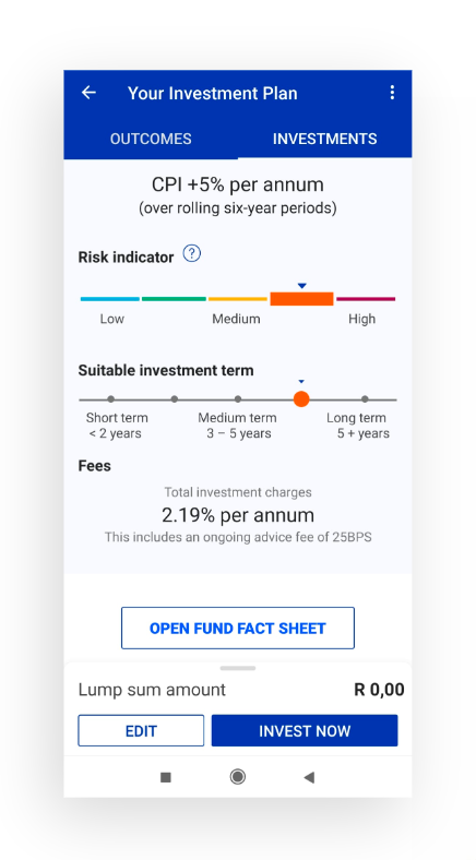
The button "OPEN FUND FACT SHEET" breaks the hierarchy of application buttons. Use a new color and text style. Visually it is more important than the next two “Edit” and “Invest now” which are the main ones in the navigation flow. Change the style of “Open fund sheet” to respect the hierarchy.
C) The graphs used to show the evolution of the users' wealth are hardly interactive, and their design is not attractive.
D) The design is sometimes inconsistent and is overloaded with content. The texts are not correctly laid out, and the elements of the design do not have correct padding and margins.
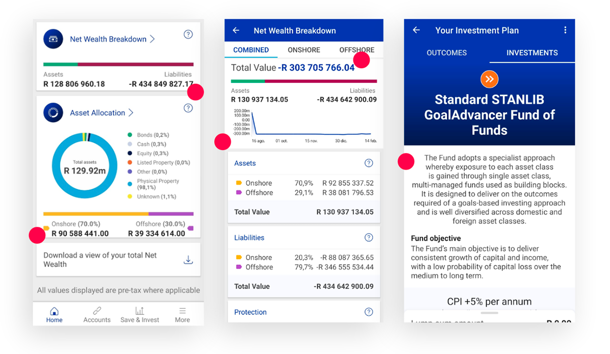
E) The visual hierarchy in terms of colours, icons, typography and visual elements is not always respected or consistent.
F) Page titles do not always match the page names in the menu. Actions such as ‘Add a new asset’ are not easy to identify.
G) A multitude of interactive and clickable elements do not seem to be functional. The user makes a mistake by not being able to identify which elements are clickable and which are not.
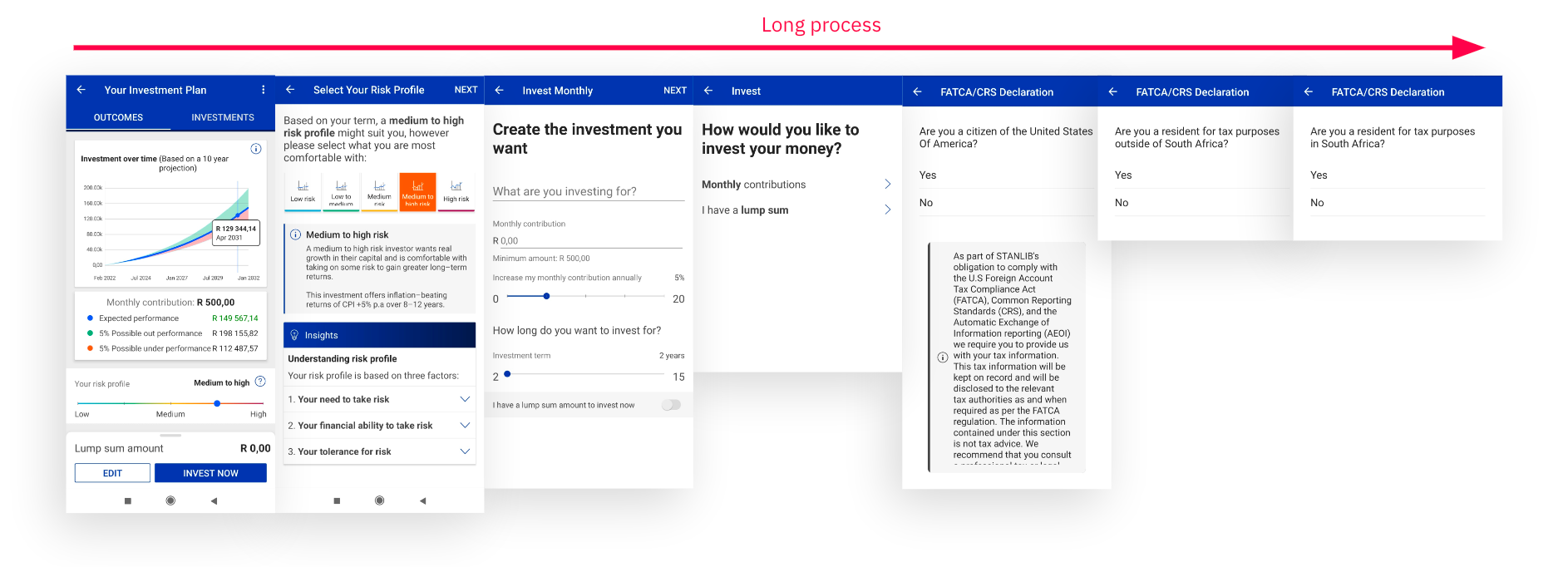
H) In long processes, there are no steppers that indicate to the user at which point of the process they are.
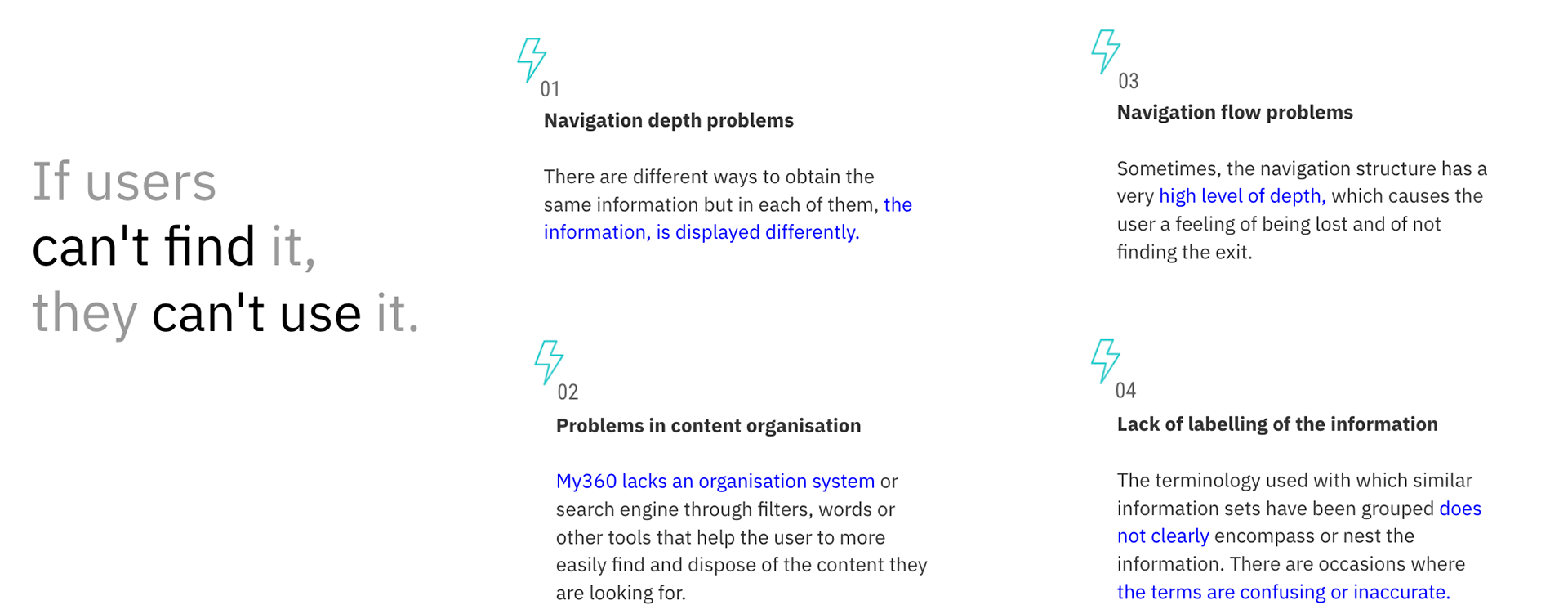
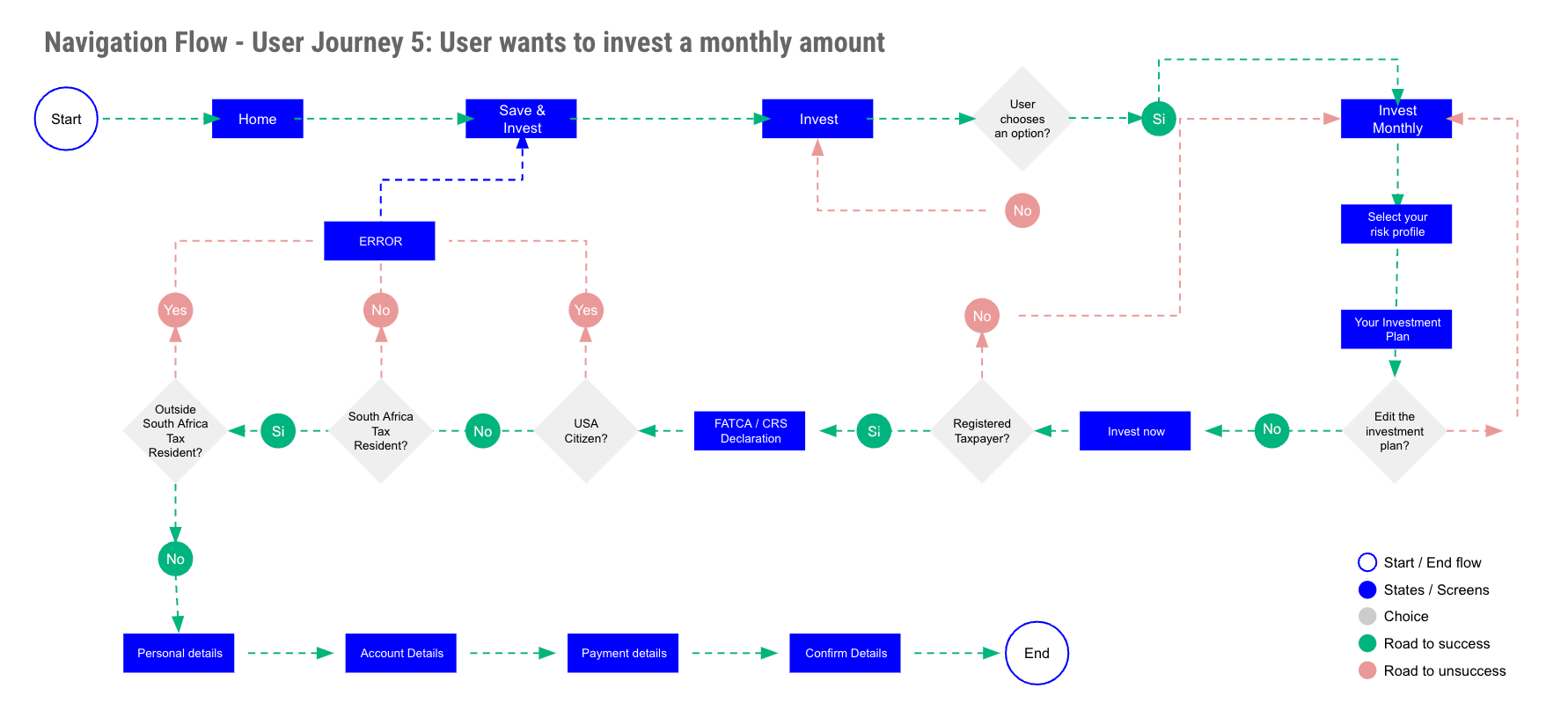
Heuristic Analysis: Frictions in information architecture and navigation system
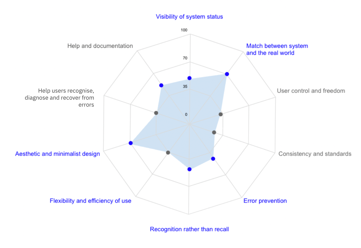
Heuristic Analysis: Results
Results from Jakob Nielsen's 10 general principles for interaction design. They are called ‘heuristics’ because they are broad rules of thumb and not specific usability guidelines. We have to improve the following:
Features Analysis: Current features and opportunities
Wealth tracking:
Add a more interactive graph where the user can choose a certain period of time in which they want to see the progress of their wealth. For example, if you compare with a year ago, your wealth has increased by 2%, but if you compare with 5 years ago, your wealth has decreased by 4%.
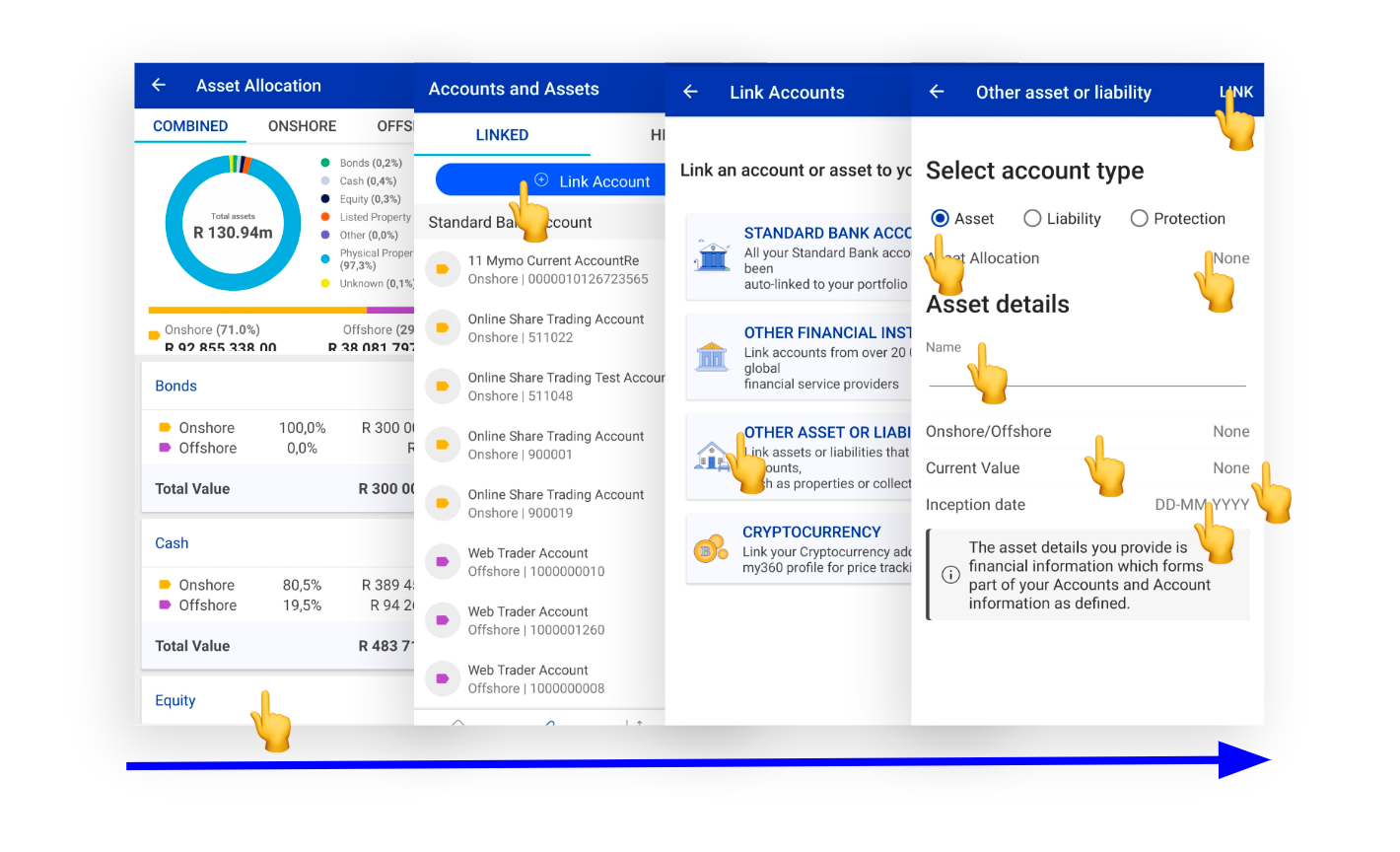
Aggregated view of assets:
Add the functionality so that the user can use an internal search engine and locate a specific asset or liability. Also add the option to filter and sort the search results.
Consolidated accounts view:
Again add the functionality so that the user can use an internal search engine and locate a specific asset or liability. Also add the option to filter and sort the search results. Offer the possibility to the user to remove assets or unlink accounts, not only the possibility of hiding them.
Save & Invest feature:
Add the option so that the user can choose between the different investment products of the bank, as well as the option to invest in the stock market and in specific shares of companies through the bank. Make the creation and customisation of your investment portfolio more flexible. Visually show the evolution of your investments and savings plans.
More:
Add the option so that the user can access their profile and manage their data, password, preferences, notifications etc. Give the user the option to choose the financial education topic they want to learn about and generate appropriate content for each topic.
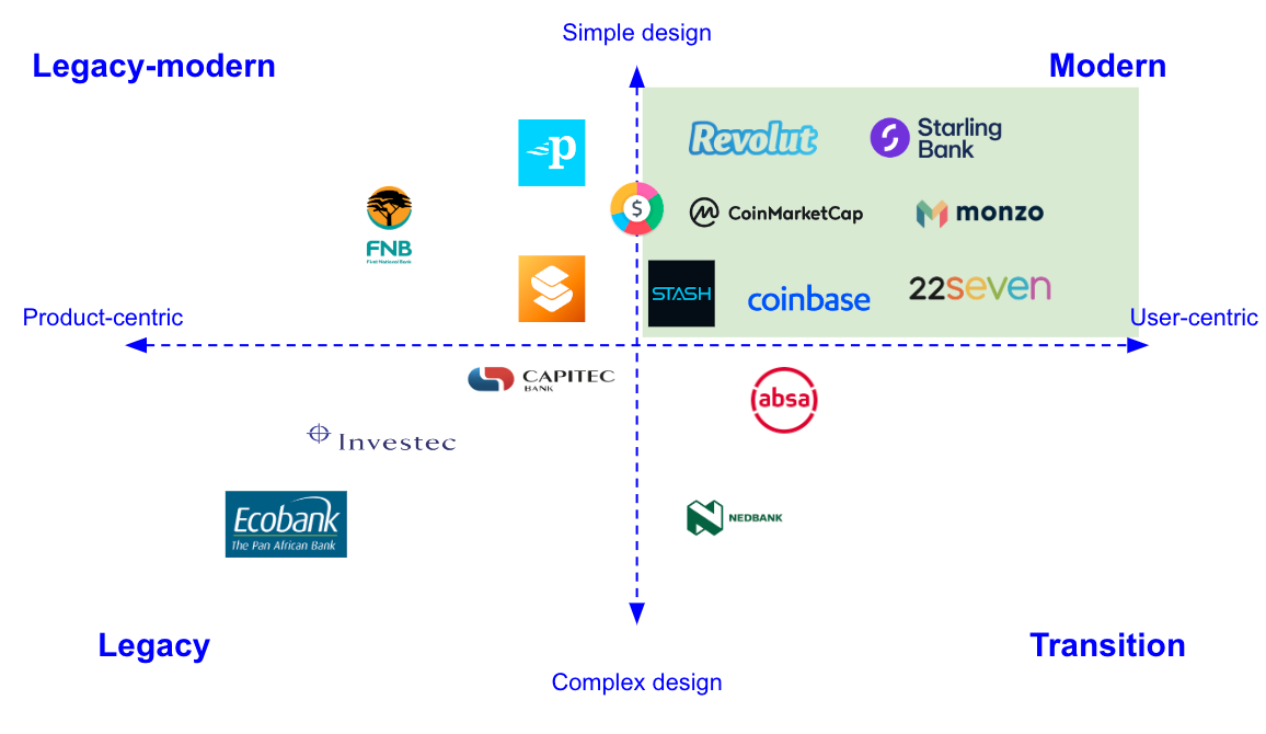
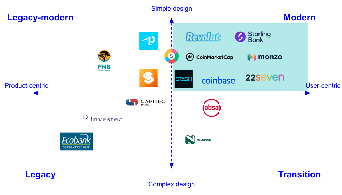
Benchmark: Competitor analysis
We are going to use a positioning map based on 2 axes:
- Customer centricity
- Design complexity
We define 4 different types of banks depending on the assets we defined:
- Legacy-modern: Product-centred but with new easy-to-create designs
- Modern: User-centric with a simple design that helps users
- Legacy: Product-centred banks with a complex design
- Transition: Product-centered but still with a complex design
The interviews
Then we developed a series of interviews to understand the user perspective regarding My360. We ran 2 sets of interviews with different targets to grasp a more holistic view of the My360 perception from the customer side
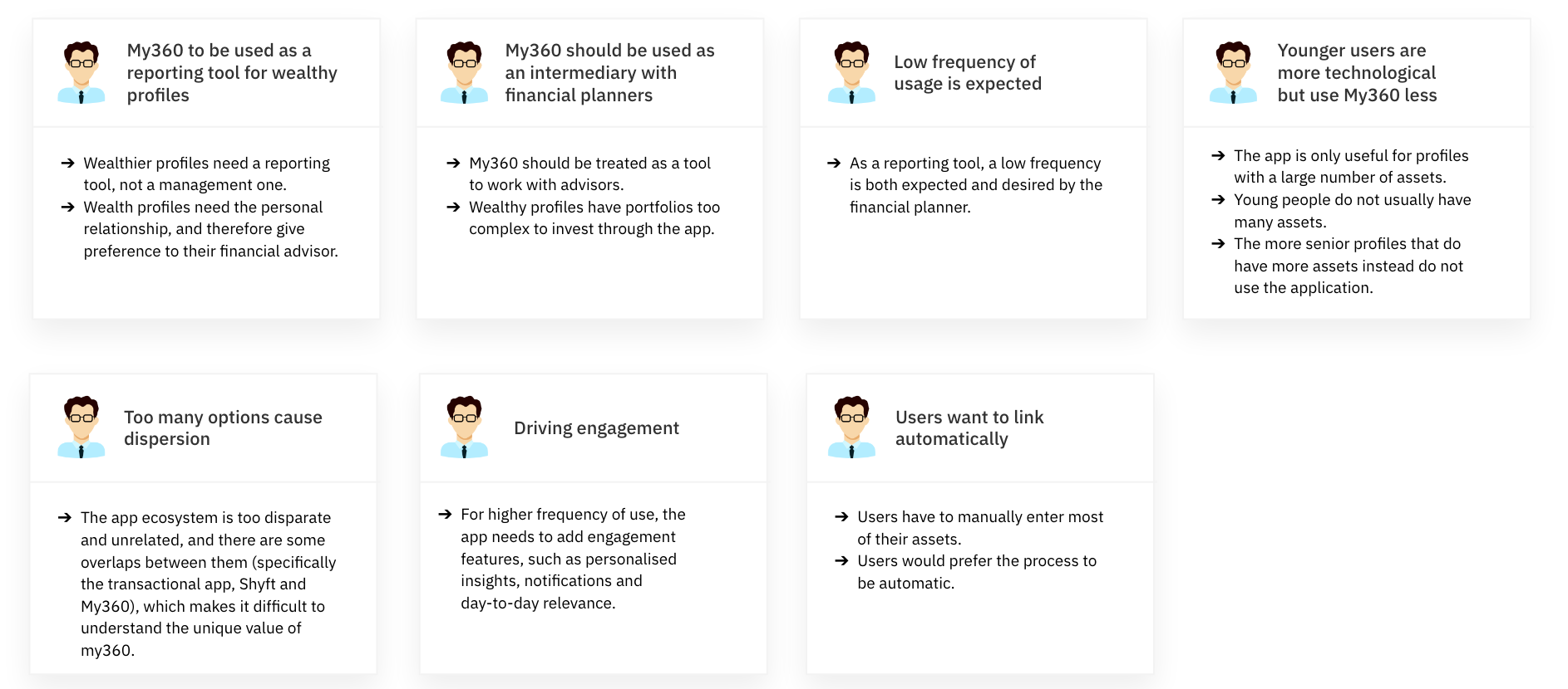
SB Financial planner interviews: Financial planners that support wealth customers manage their accounts and investment portfolio. (5 online interviews approx. 45 min.)
My360 users interviews: Standard Bank customers that are regular My360 app users (8 online interviews approx. 30 min.)
Key takeaways and conclusions
That helps us reach 2 conclusions regarding why users resist linking their accounts and have a low usage of the app:
First Conclusion: Based on the heuristic analysis, clients don’t use the app due to poor and inadequate user experience. The My360 app does not comply with the Jakob Nielsen’s 10 Usability Heuristics for User Interface Design*, which affects its user interface (UI) design, its internal user experience (UX) and information architecture (IA).
We can detect these problems from its information design, usability and functionalities, right down to its visual design and consistency. Usability bugs can cause user frustration and have a serious impact on application goals.
Second Conclusion: Clients don’t use the app due to a misalignment between their needs and the app’s purpose and functionalities. Users only use the app partially (few functionalities) because there is lack of match between the value proposition offered by My360 and the real needs of customers.
Wealthy users have very low usage/interaction with the app and mainly use it to check their assets dashboard evolution or check the app together with their financial planners.
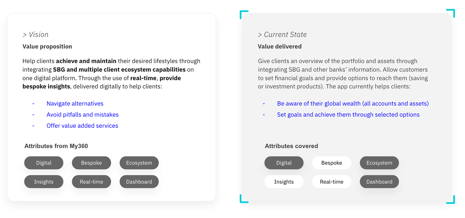
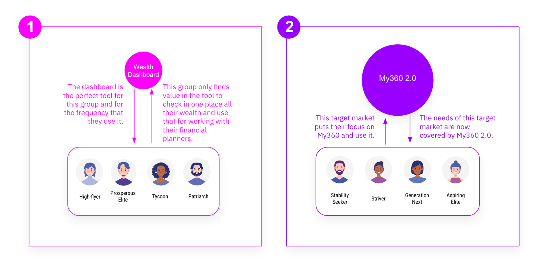
How the initial value proposition is misaligned with the value currently being delivered:
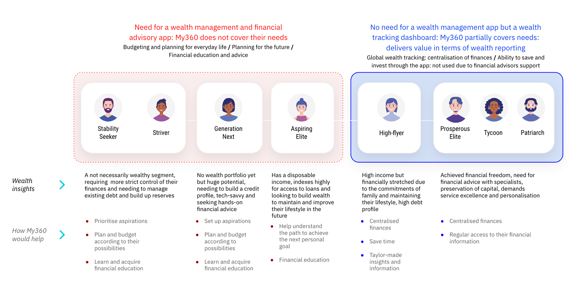
How the target customer focus of the app influences its low usage:
How the target customer focus of the app influences its usage:
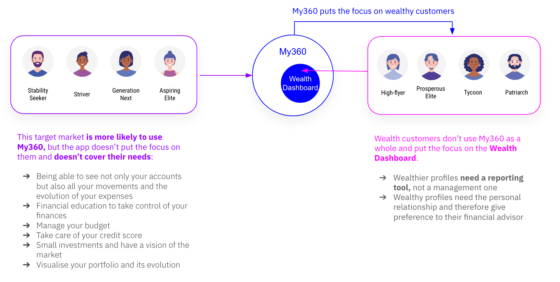
How do we differentiate ourselves from competitors?:
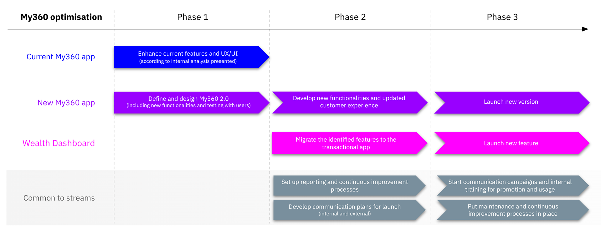
Recommendations and roadmap:
Our recommendation entails 2 streams of action: How can we get people to use the app? How can we make the app correspond to the user’s needs?
1. Improve and optimise the functionalities that are most useful and appreciated by users: the Wealth Dashboard.
Integration in the Standard Bank Ecosystem > Wealth Dashboard
2. Transform the current app into a new, modern and powerful tool that covers all My360 objectives and offers each target market what they need, allowing to increase engagement with users. Redefinition of the app at its core > My 360 2.0
Focused on the My360 personas, their needs and aspirations and how the app currently serves them:
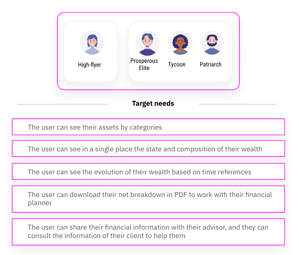
Wealth dashboard integration value proposition: With Wealth Dashboard, users will be able to manage their assets from one place. They will not need to download and maintain a specific application for it. With the integration of "net breakdown" in another of the Standard Bank ecosystem tools, users will be able to continue grouping all assets, liabilities and risk coverage, regardless of the financial institution, geography or insurer where the users' assets reside, consult the distribution of their assets in a single image, obtain the summary in PDF and continue working with the financial advisor. My360 2.0. functionalities: Asset allocation, net breakdown, summary PDF, share with advisor, automatic asset linking and investment.
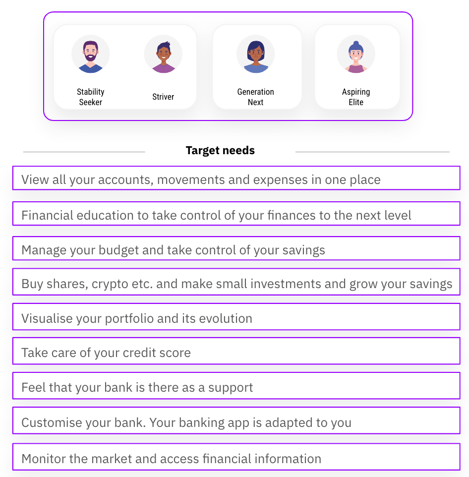
My360 2.0 future value proposition: My360 2.0 will allow customers to keep their money under with control, all their banks in one place and receiving important alerts: commissions, duplicate receipts etc. The customers can manage all their accounts and make investments in the main products from one place. Their movements are automatically grouped by categories, and they will be able to see the evolution of their money in real-time. The users will be able to establish budgets and have a monthly forecast of what they will spend and on what, receiving financial advice based on their finances. My360 2.0 functionalities: Expenses aggregator, financial education, budget, investment, portfolio, credit score, virtual assistance, customisable profile and financial news.
We believe this recommendation enables My360 to reach a wider audience while preserving their current users:
Wealth Dashboard: Integration of new feature: into the Standard Bank transactional app.
Target customer:
- Wealth and Investment segment
- Clients with financial planner
- Standard Bank customers
My360 2.0: Realignment of My360 vision and
value proposition towards a different target customer.
Target customer:
- Upcoming wealthy customers
- Not necessarily wealthy, in need of support managing their finances
- Standard Bank customers
- Non-Standard Bank customers